How can AI help design an interactive showcase that guides people through an experience clearly, without needing someone there to explain each step?
Context
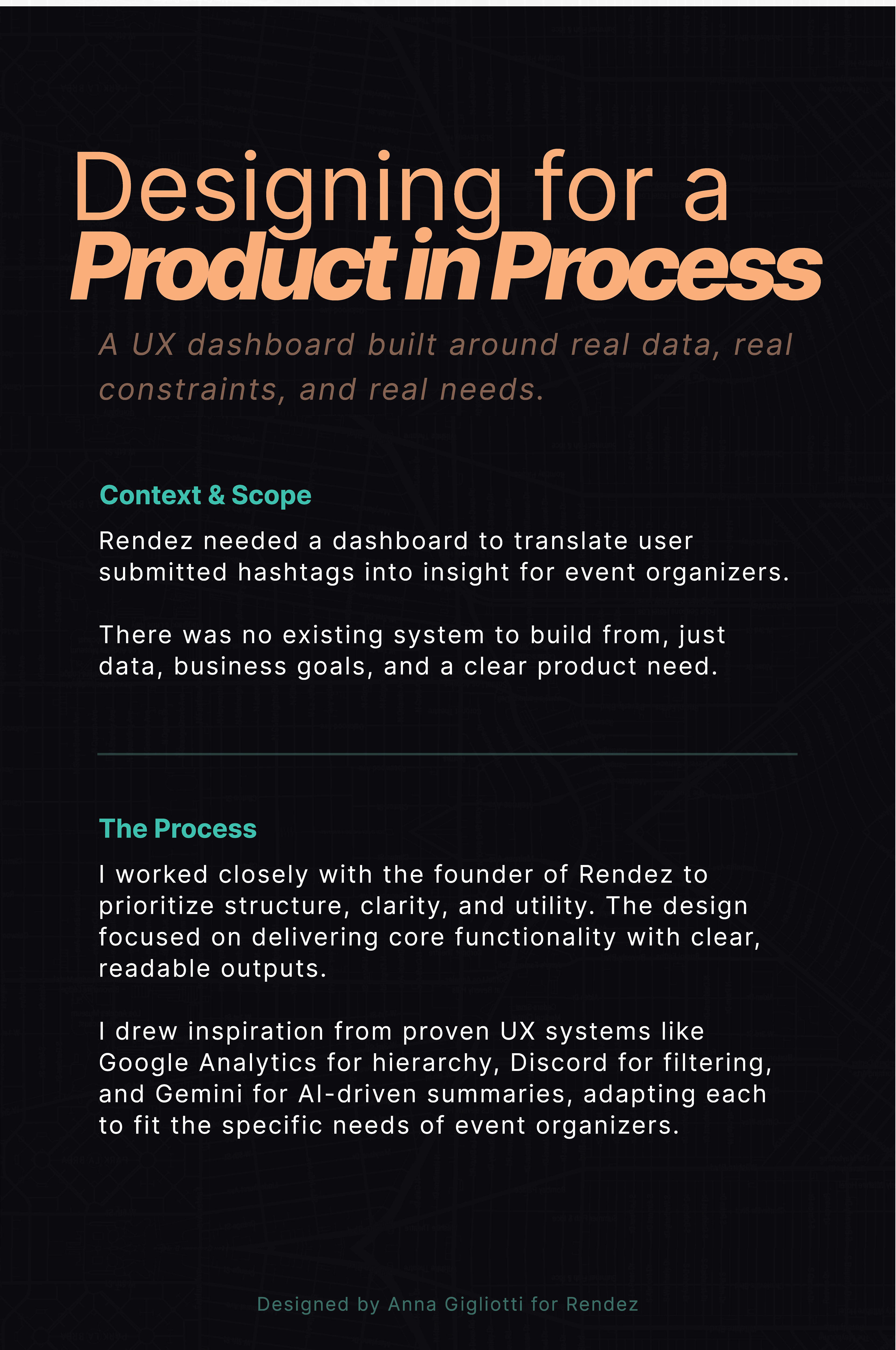
My capstone project was a B2B dashboard designed for event organizers, built around the idea of zero party data: information that users intentionally and voluntarily share. To bring that concept to life, I created a three step interactive showcase: first, visitors were prompted to contribute their own data; second, they were shown how that data represented the room and why it mattered; and third, to let users explore my dashboard prototype that visualized the information and learn about the design decisions behind it.
The challenge was making the experience work without live interaction in each step. I aimed to allow users to walk up, interact with step one on their own time, and then I could talk them through the project. The posters included in this showcase had to guide people through the interaction without being babysat. I used AI throughout the process to help me figure out what needed to be communicated, how to structure it, and how to make it clear and engaging. It wasn’t about outsourcing the design, it was about designing smarter, with faster feedback and sharper decisions
Tools Used
Design work was done in Figma and Illustrator, with ChatGPT aiding in planning, layout critique, and copy refinement.
Methods & Process
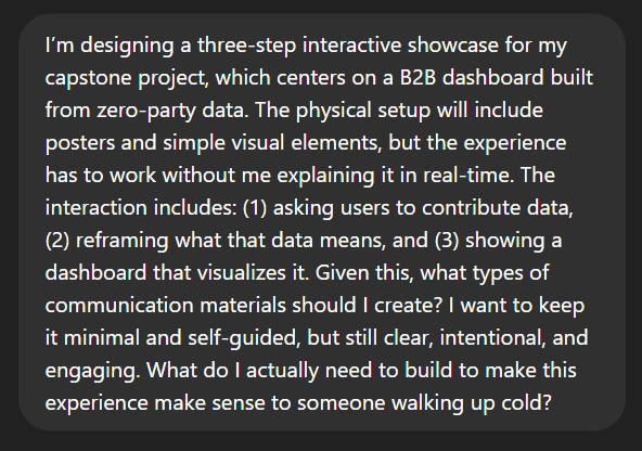
Prompt to assess showcase needs
Prompt for Planning poster layout
When planning for the showcase, I knew I wanted an interactive element, but I also knew I wanted to spend my time talking to visitors about my showcase. My goal for the posters was clear: guide users through the interactive portion of the showcase on their own, allowing me to have more interesting and in depth conversations about the project itself.
I used ChatGPT to help plan what pieces of communication were needed for this. I provided a description of the showcase context, goals and spatial constraints, and asked what types of visual communication would best support the interaction. I clarified that the posters needed to both explain the project and stage the experience. From this, I arrived at a structure: three guidance posters (one to prompt data contribution, one to reframe and contextualize that action, and one to present the dashboard prototype), plus two supporting posters detailing the design process and key decisions.
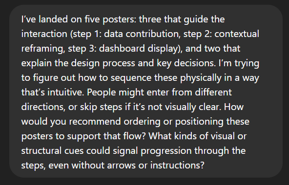
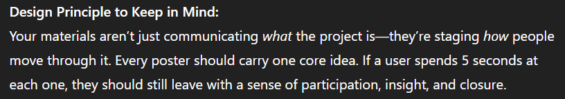
I then used AI to help refine how these pieces would function together. I prompted it with content outlines and asked how to sequence elements to support user flow, how to signal across steps, and how to maintain clarity without overload. I focused on instructional language, especially for the interactive portion of the showcase.
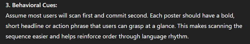
ChatGPT Response on designing showcase structure and flow
ChatGPT response on structure development
Feedback on Distinguishing guidance posters from process posters.
Once I had the structure mapped out, my initial focus was on how to visually distinguish the three guidance posters from the two supporting posters. I used AI to help thing through options for visual conteast- layout, scale, structure, and color. I wanted the different categories of posters to operate under the same design system while also being visually distinct. The result was a clear system: one design for the step by step posters, and another design for the process posters, with the same fonts and colors, but different sizes and background colors.
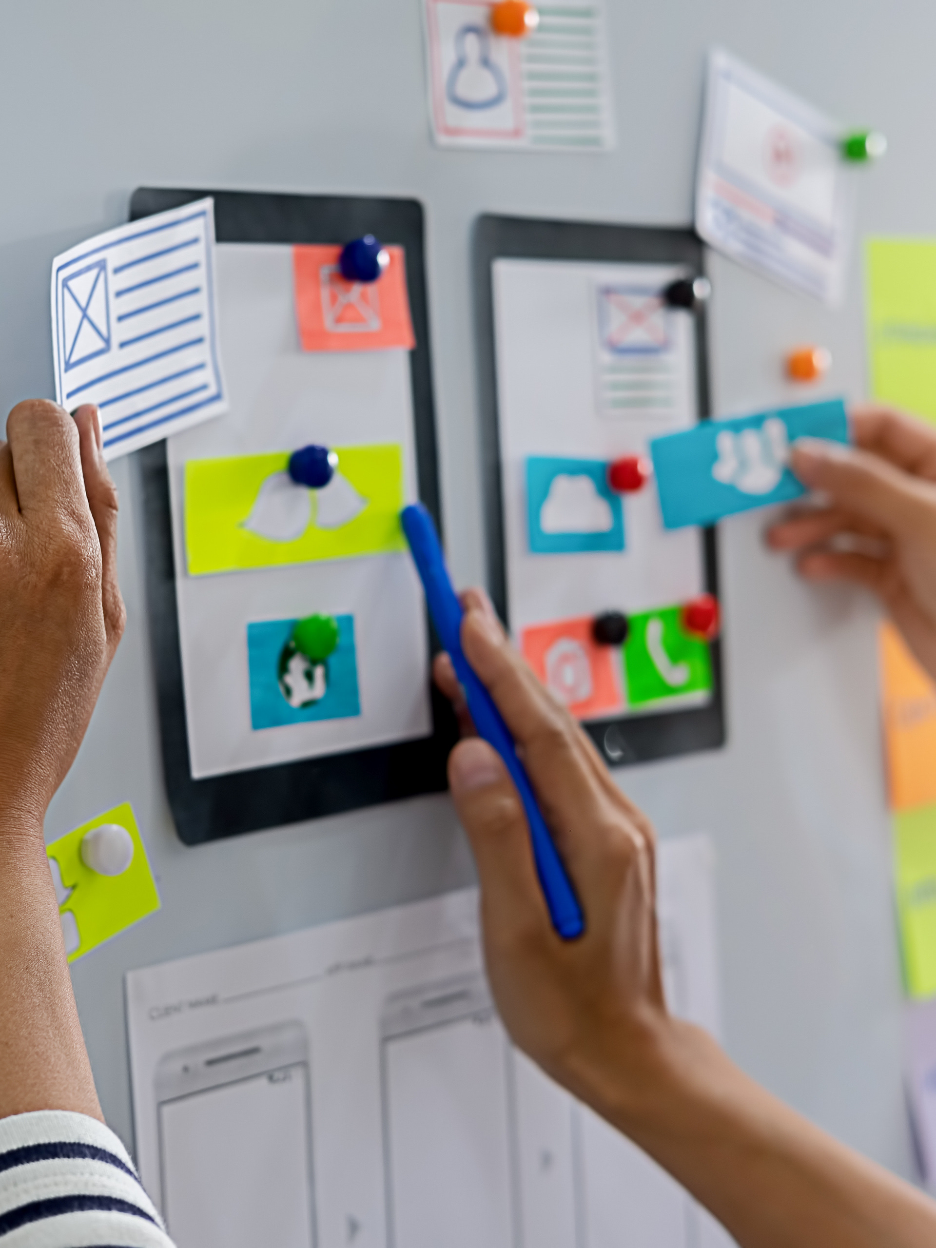
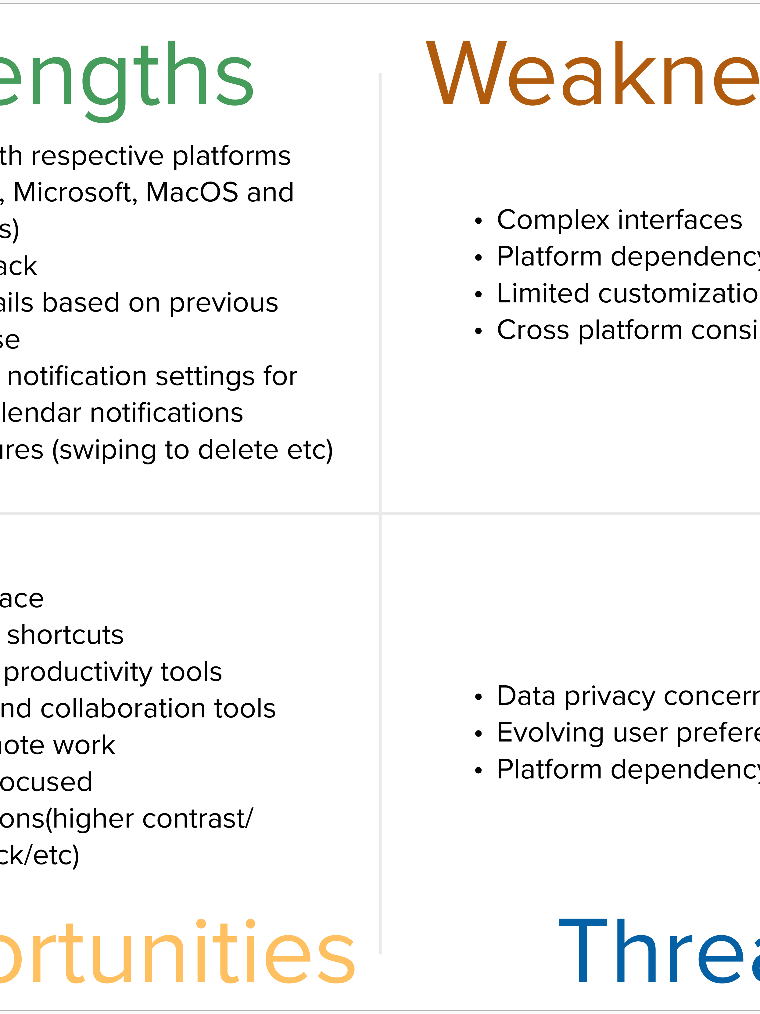
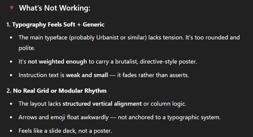
Once I had a plan for exactly what posters I needed and a general idea of how they should look, I mocked up each poster and used AI to critique the layout and visual tone. The feedback (pictured to the right) surfaced issues I hadn't articulated: the typeface was too soft and geneeric, the instructional copy was too small to register, and the layout lacked alignment. It pointed out that the composition felt more like a slide deck that a poster.
This critique pushed me to rebuild the layout system. I introduced clearer vertical alignment, adjusted type scale and contrast, and sent it again. This started a rapid feedback loop: I'd make revisions, screenshot the new version, and ask for another round of critique. Each pass helped me catch something new, whether it was inconsistent spacing, weak focal points, or too much visual noise. I kept refining until the layout felt clear, intentional, and anchored. The pace of this back and forth let me move quickly without second guessing every choice.
Poster Feedback
Deliverables
I ended up with five posters: three that walked people through the interactive part of the showcase, and two that explained the project itself. The goal was to make the whole thing understandable without me standing there narrating it. I used AI along the way to help figure out what each poster needed to do, how to lay things out so they'd actually get read, and how to write copy that was clear but not stiff. The posters were the final deliverables, but really, the outcome was the full experience: something people could step into, move through, and get without needing a walkthrough.
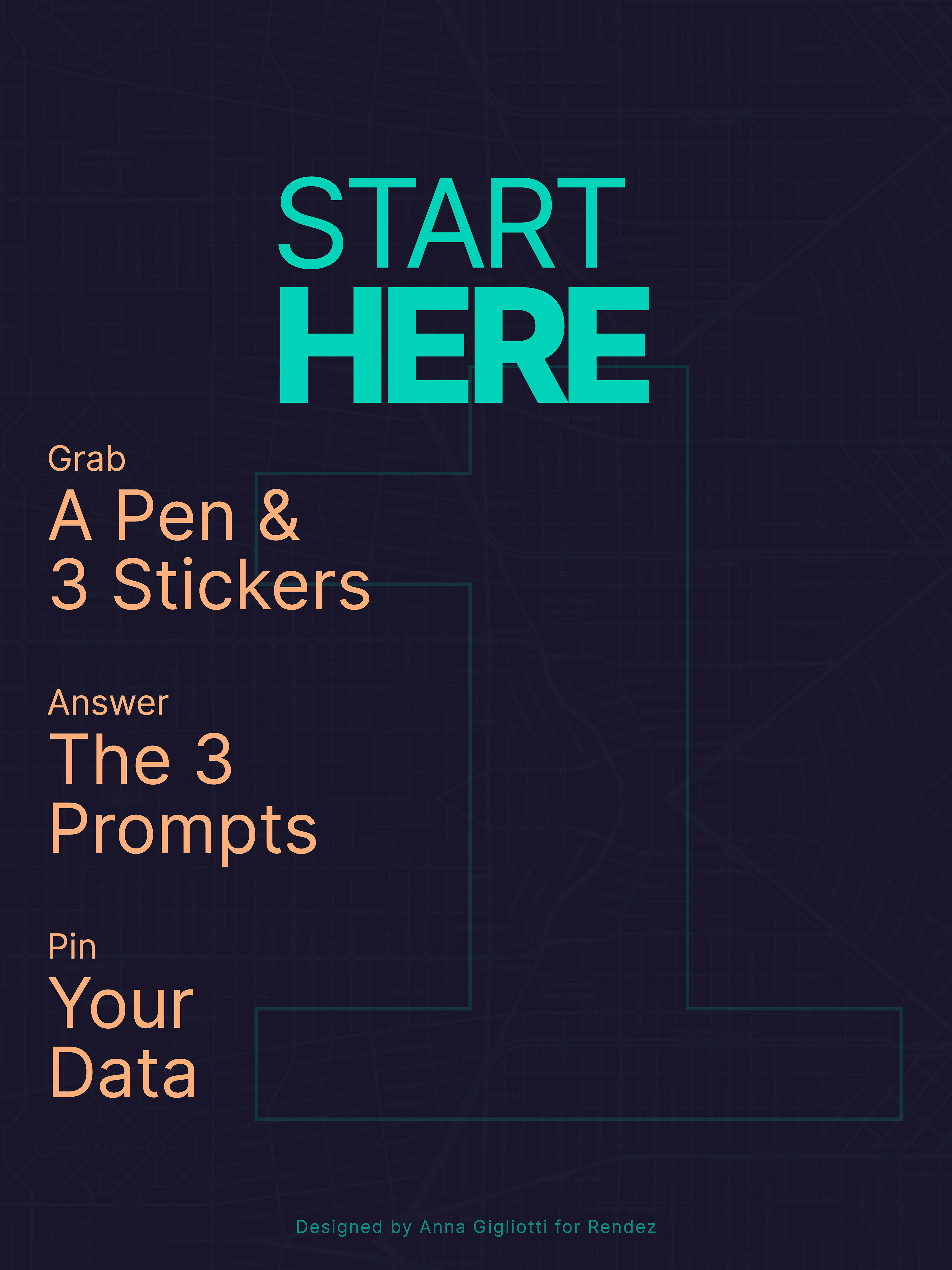
Guidance Poster 1
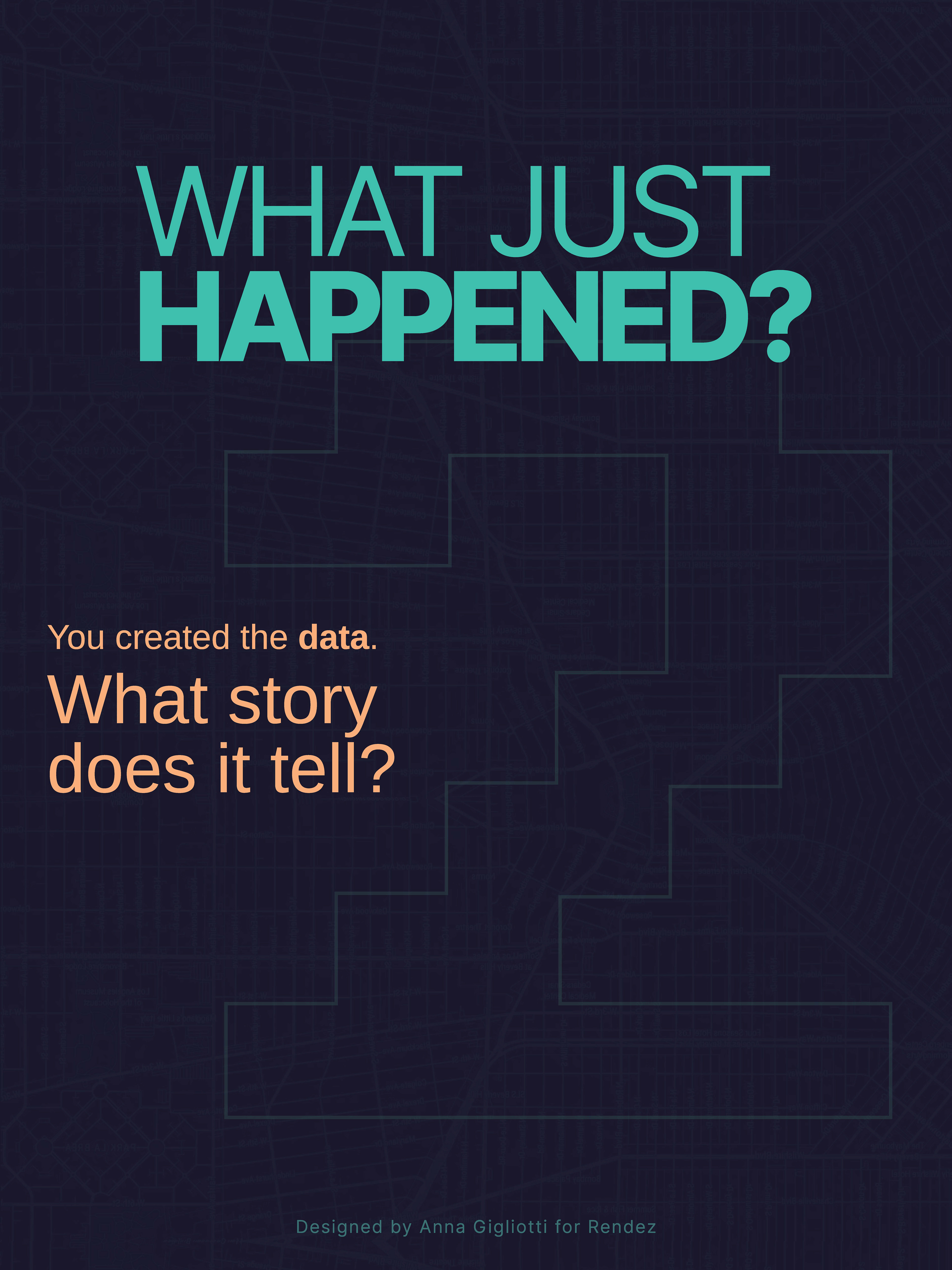
Guidance Poster 2
Guidance Poster 3
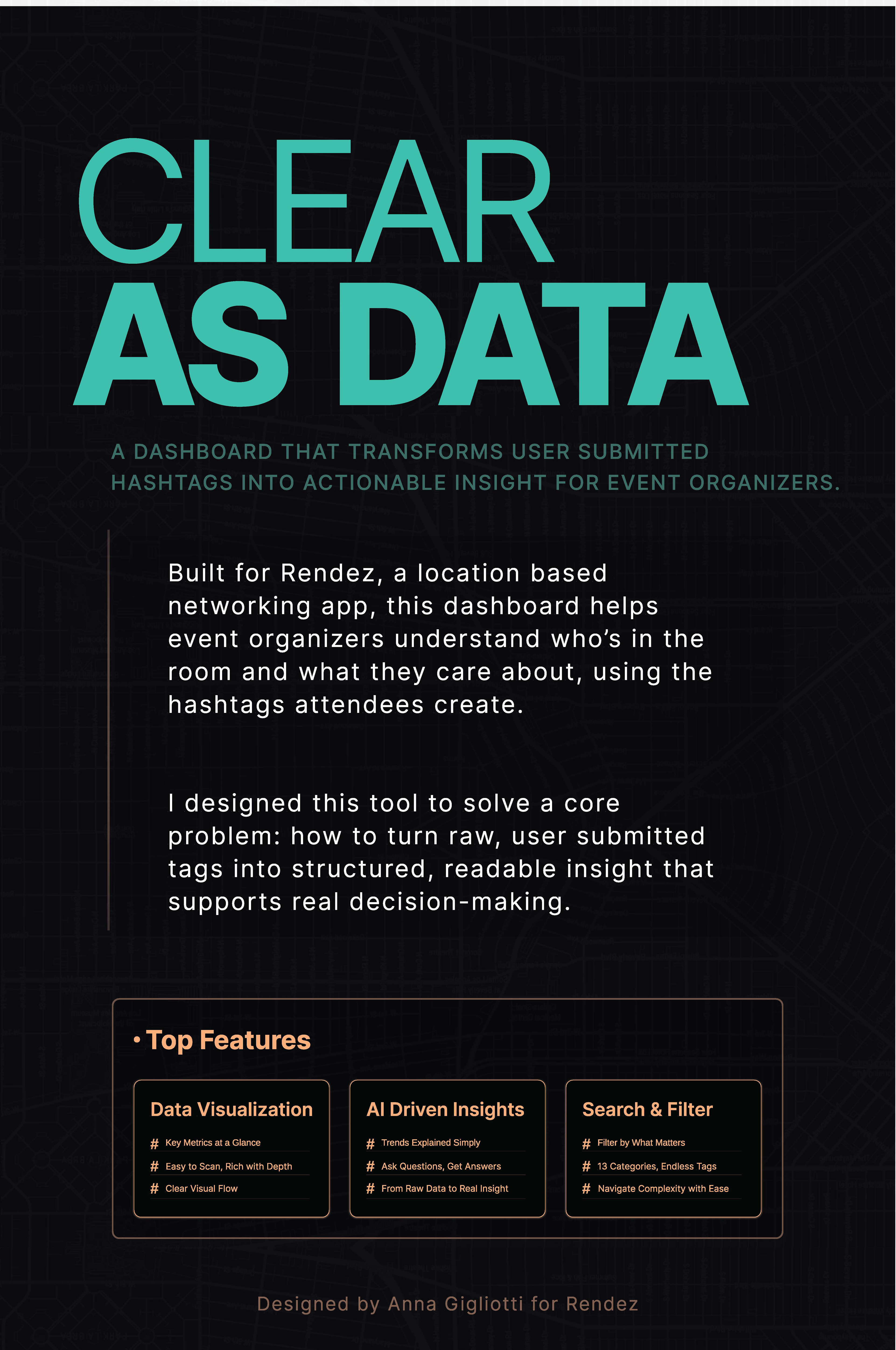
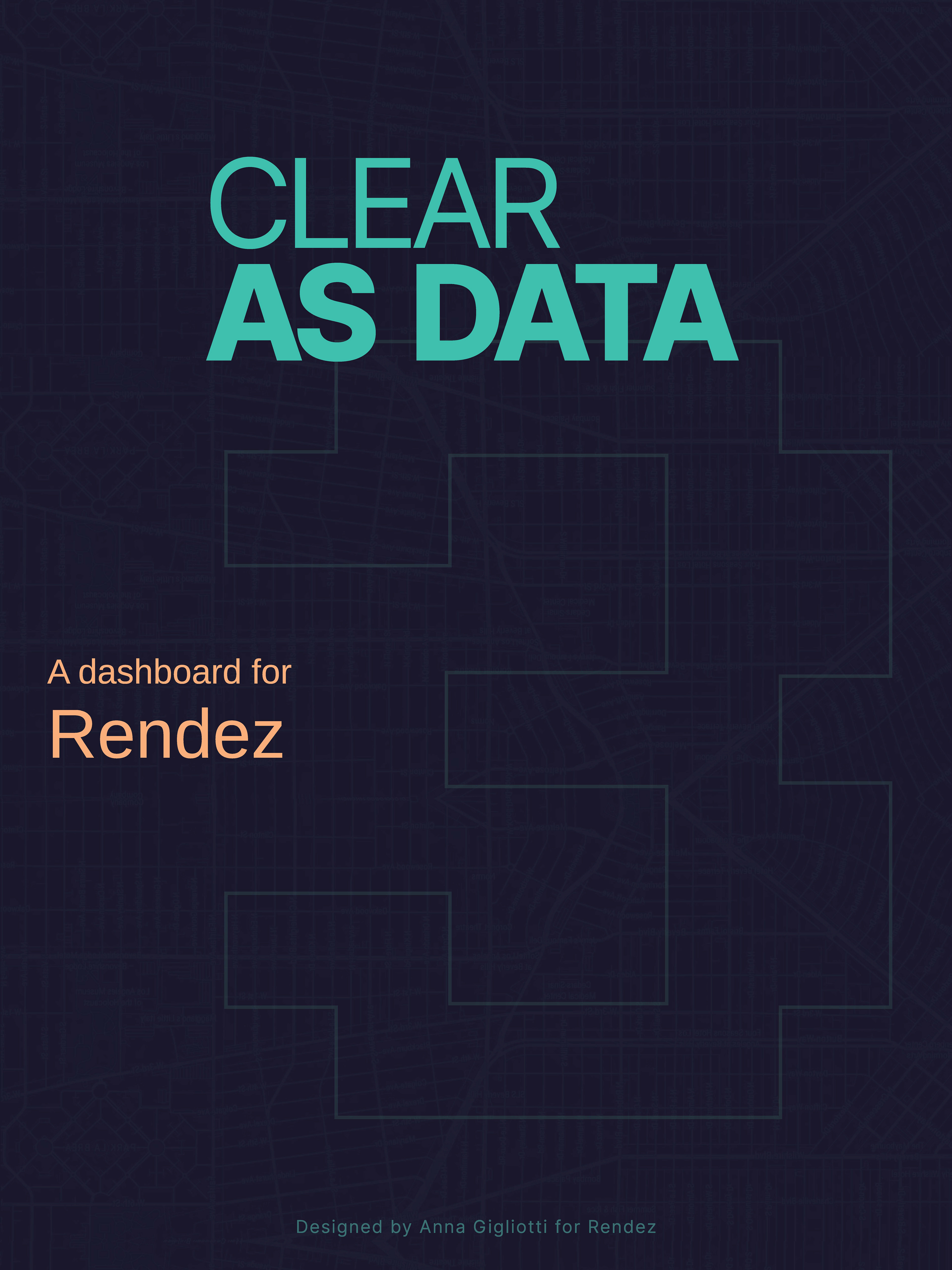
Project Overview Poster