Role & Context
I led this project as the sole designer for my senior capstone, a sixteen-week engagement in Spring 2025. Rendez, a location-based networking app preparing to launch, was seeking partnerships with event organizers in Los Angeles. My responsibility was to design a dashboard that demonstrated the value of Rendez’s user-generated data and to create interim tools that could be used immediately in business conversations.
Role
UX Design, Data Visualization, Prototyping
Year
Spring 2025
Length
16 weeks
Brief
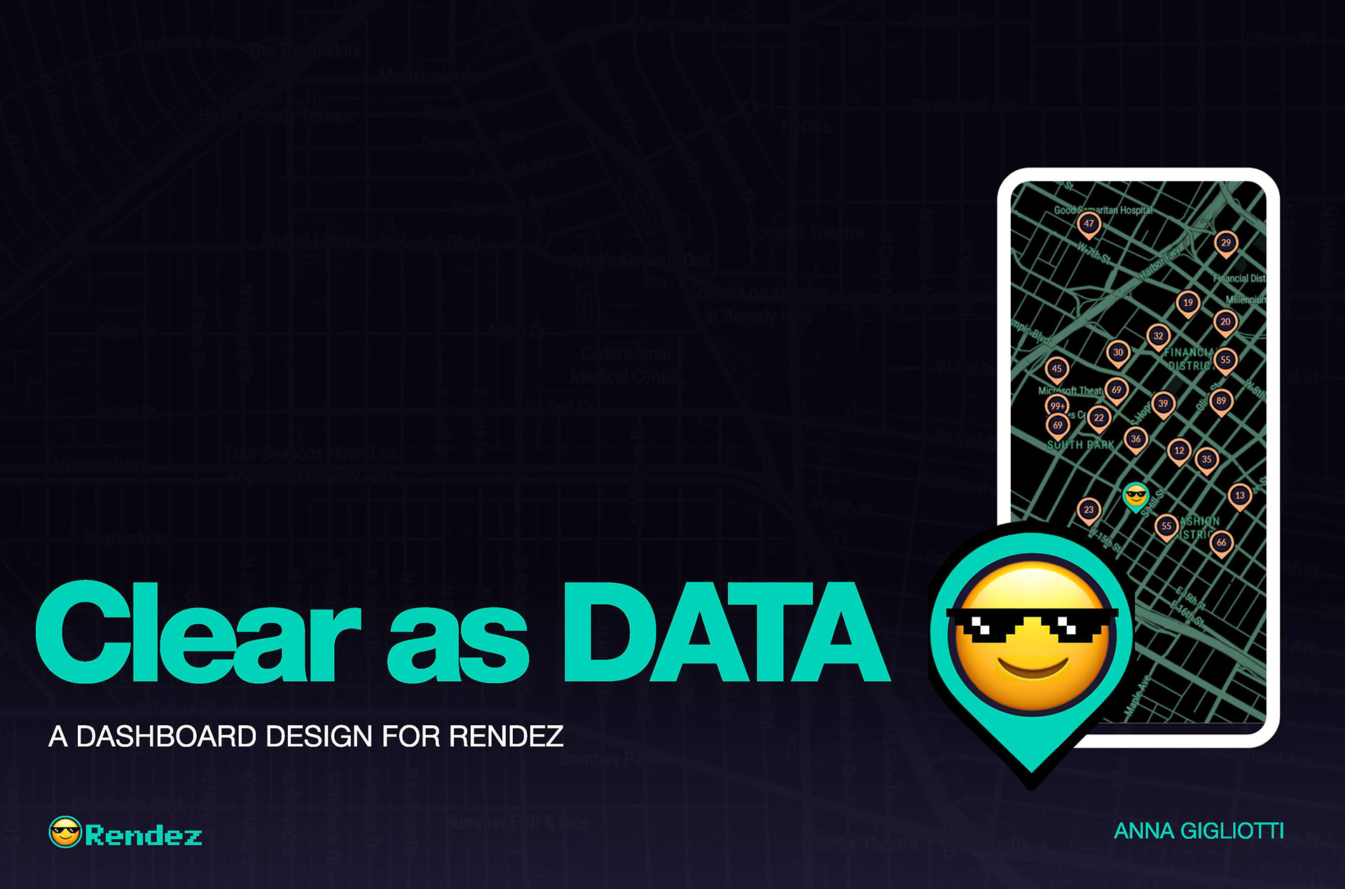
Rendez is a location-based networking app that connects people at events through hashtags tied to skills, industries, hobbies, and interests. The long-term goal was to help organizers make sense of this dataset through a dedicated dashboard. The short-term goal was to secure partnerships before launch, even though the app had no live users yet.
To bridge that gap, I designed not only the dashboard prototype but also fillable PDF reports that highlighted sample insights and a tailored sales pitch aimed at one local tech event company. These deliverables supported immediate business needs while setting the foundation for the product’s future capabilities.
Project Challenge
Problem
The project was shaped by two main constraints.
First, the data model itself was messy. Hashtags existed only as raw lists spread across thirteen categories, making it difficult to extract meaning. Overlap across categories created ambiguity, for example, “tech” could appear as a skill, industry, or hobby. At scale, volume would bury important signals unless hierarchy and structure made them clear.
Second, Rendez had no live data. The dashboard needed to feel credible enough to persuade partners using only hypothetical examples. This required designing a system that showed long-term potential while also creating immediate, lightweight deliverables for the founder’s partnership conversations.
Insights
Through research and exploration, several insights shaped the design.
Organizers want meaning, not raw data. They are not trying to sift through everything but to find patterns that guide decisions. Clarity depends on hierarchy, because even small datasets feel overwhelming if presented without structure. Visual polish strongly influences trust; misalignment or inconsistent spacing makes people hesitate even when the numbers are accurate.
Finally, different users require different depths of interaction. Some need quick summaries while others want detailed exploration, so the design needed to accommodate both.
The business context added another layer: credibility had to be established immediately, not after launch. This meant the solution had to include both a long-term product vision and short-term, partner-facing deliverables.
Solution
The solution unfolded across three layers.
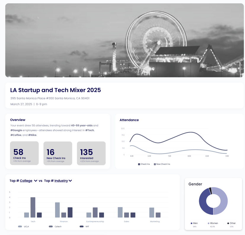
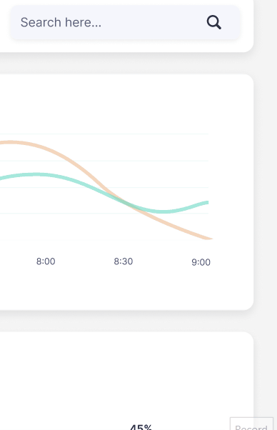
The dashboard prototype was designed to make complex data approachable. At the top, an AI generated summary highlighted key takeaways instantly. A demographics section provided context, grounding the dataset. The main view presented the top hashtags from each category, with the option to drill deeper. Filtering and search allowed comparisons across categories, such as seeing how “design” appeared as both a skill and an industry. A built-in chatbot supported natural questions like “What’s trending with early career attendees.” The design balanced fast readability with pathways for deeper analysis.
To address the pre-launch gap, I created fillable PDF reports that highlighted sample trends in a polished, shareable format. These reports acted as a stand in for the dashboard and gave the team something to share with partners immediately.
Finally, I developed a tailored sales pitch for a specific LA tech event company the founder was targeting. By combining the dashboard vision with interim reports, the pitch made the data feel both credible and actionable. That company ultimately became a partner, validating the design approach and showing its direct business impact.
Process
Secondary Research
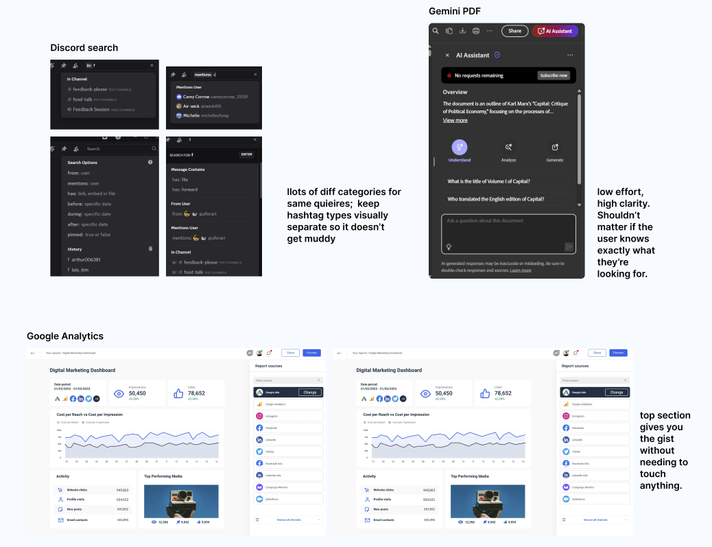
I studied platforms such as Google Analytics, Discord, and Gemini to see how they presented complex data without overwhelming users. A recurring theme was the importance of anticipating user questions and surfacing answers early, rather than displaying raw volume.
Main Takeaways and Feature Highlights
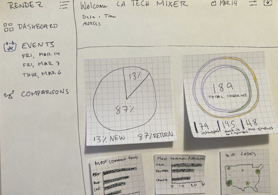
Initial Sketch of Dashboard
Sketches & Wireframes
I began with sketches and low-fidelity wireframes to test structure, pacing, and hierarchy. This helped me quickly identify where overwhelm might occur and refine the flow before committing to higher fidelity designs.
User Testing
Even informal testing provided crucial adjustments. Users expected filters at the top of the dashboard, so I moved them out of a secondary panel into a primary position. They also skimmed summaries but skipped detailed tables, which inspired the AI-generated highlights section. Observing these behaviors validated the importance of hierarchy and confirmed the need for multiple levels of depth.
User Testing
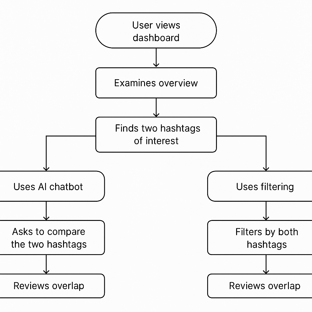
User Flow: Hashtag Comparison
User Flows
I mapped flows for both scanning and exploration, ensuring that the most essential features appeared upfront while allowing deeper investigation as needed. Iterating on hierarchy was critical for balancing immediate clarity with long-term flexibility.
Information Prioritization & Hierarchy Planning
One of the hardest design decisions was deciding what organizers should see first versus what could appear later. I experimented with different layouts and display patterns, testing how early placement shaped understanding. Top trends needed to surface immediately, demographics needed to ground the insights, and filtering controls had to be accessible without dominating the view. Balancing these elements defined the dashboard’s core structure and set the tone for the overall experience. Getting the hierarchy right was less about aesthetics and more about making the data intuitive from the very first glance.
Early Wireframe
Results
The final outcome was more than a prototype. It was a suite of deliverables aligned to both product and business goals:
A dashboard prototype that demonstrated the long-term vision for organizing Rendez’s dataset.
Fillable PDF reports that gave the team a tool to share insights with partners before launch.
A sales pitch crafted with a target event company in mind.
These deliverables helped Rendez secure that company as a partner, achieving the short-term business goal while laying the foundation for future product development.
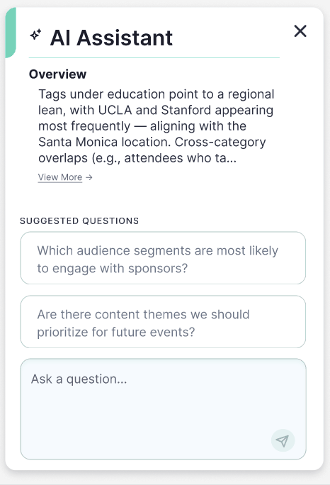
AI Assistant
Search Flow
Reflection
This project taught me that design’s role is not only to make products usable, but also to make businesses credible. By focusing on clarity, trust, and hierarchy, I transformed unstructured data into a narrative organizers could act on. By creating interim reports and a sales pitch, I helped Rendez succeed in the critical pre-launch phase.
The most important lesson was that people do not open dashboards to see data, they open them to understand it. That principle guided every decision, from structure and hierarchy to visual polish. Looking ahead, the system could evolve with event comparisons, saved views, and custom layouts, but the foundation is already in place.