How can we create a user friendly system to help non English speaking travelers find their way through Los Angeles Airport?
Product Demo Video
LANA:
LAX Navigation Assistant
A multilingual kiosk system designed to help non-English speaking travelers navigate Los Angeles International Airport (LAX) with ease, offering interactive, language friendly guidance and real time directions supported by visual aids.
Design Challenge
This project addressed the navigation challenges faced by non English speaking travelers at LAX. The goal was to improve accessibility by creating a system that would help travelers navigate the airport independently. LANA was conceived as a solution to simplify directions, enhance the airport experience, and promote user autonomy, while supporting diverse languages through kiosks strategically placed across the airport.
Role
User Research, UX Design
Year
Fall 2023
Length
16 weeks
Project Team
Carey Corrow, Ryn Rangel
Overview
Problem
Navigating LAX is challenging due to its complex layout, English only signage, and limited multilingual staff. Non English speakers face significant difficulties in finding their way independently, often resorting to unconventional measures like requesting wheelchair assistance even while able bodied just to be guided to the right gate.
Insights
Research revealed a strong need for multilingual communication tools at LAX. Many non-English speaking travelers struggled with unclear signage and lacked autonomy in navigating the airport. Participants often felt frustrated by the complexity of the layout and expressed a desire for clearer, visual guidance. This highlighted the importance of visual aids and personalized directions to reduce stress, improve independence, and make the airport more accessible for all users.
Solution
A network of multilingual kiosks providing real time directions, visual landmark aids, and language specific guidance. The goal was to empower travelers by making LAX navigation more inclusive and reducing the stress of language barriers.
Process
Field Research
We visited Los Angeles International Airport to observe and understand the pain points travelers experience while navigating the space. This allowed us to identify specific challenges, such as confusing signage, a lack of multilingual support, and an overwhelming airport environment.
Transportation Directory at LAX, with similar icons used for different transportation systems.
Key Insights
• All signs are exclusively in English, and the icons can be indiscernible from each other.
• The environment is confusing, loud, and stressful.
• Existing navigation systems consist of a limited number of hard-to-locate non-multilingual kiosks and a wayfinding website that doesn't load correctly and offers unhelpful directions.
Secondary Research
We also conducted secondary research, exploring online reviews, articles, and traveler forums to gather additional insights about navigation experiences at LAX. This research revealed consistent feedback about the airport’s stressful layout and the barriers faced by non English speaking travelers.
LAX reviews on Yelp.
Key Insights
• Many negative reviews cited challenges of getting lost due to the confusing layout and limited resources at LAX.
• Non-English speakers often had to request wheelchair assistance, restricting their autonomy to move freely within the airport.
• Despite being the fifth busiest airport, LAX is frequently considered one of the most stressful.
• Flyers stress the significance of having real-time flight information available at every step of their journey.
Journey Map
We created a journey map to visualize the user experience of a non English speaking traveler interacting with the proposed multilingual kiosk. This helped us better understand their needs and the potential touchpoints for the solution.
Journey Map of flyer using a multilingual kiosk to get directions.
Low-Fidelity Wireframes
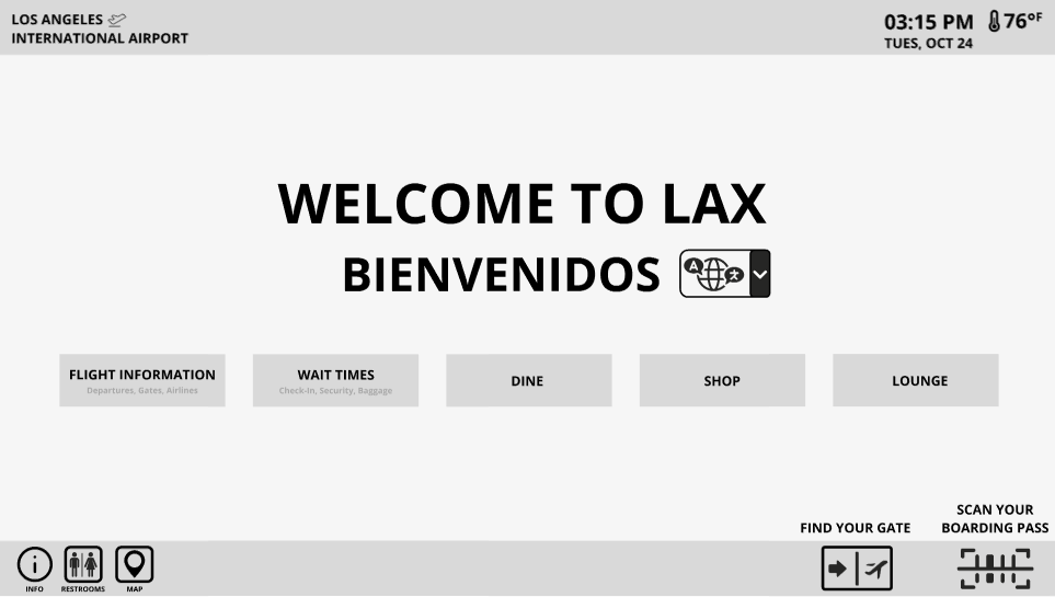
Welcome Page
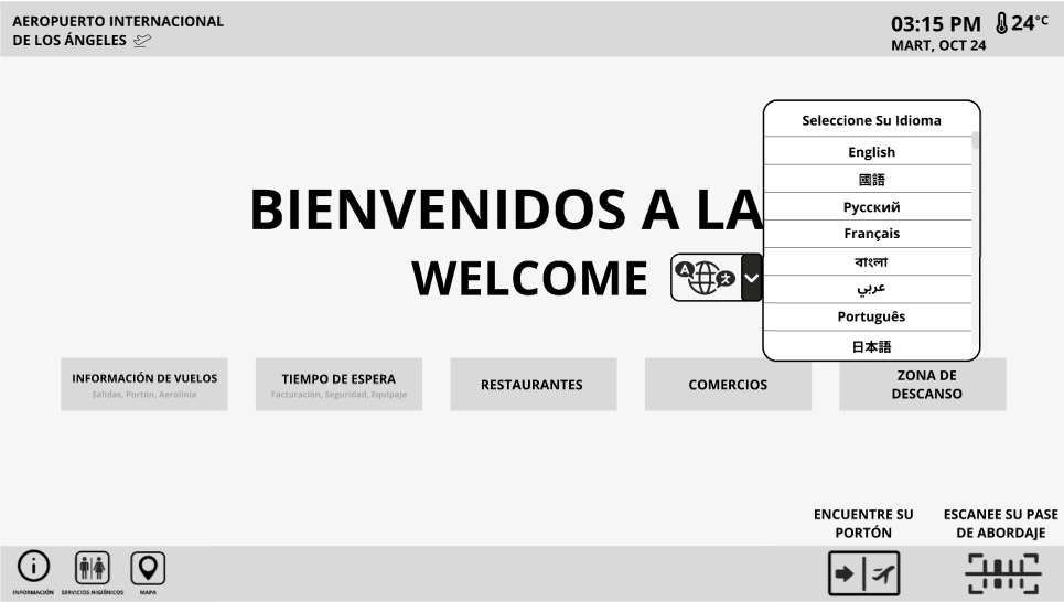
Language Selection
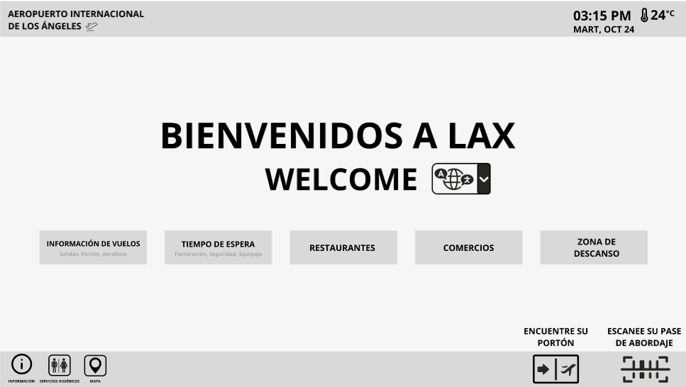
Language Specific Welcome Page
Low-Fidelity prototype of language selection.
From the insights we gathered, we sketched wireframes for a multilingual kiosk, focusing on features like language selection, step by step directions, and visual aids. These prototypes served as the foundation for designing a user friendly system.
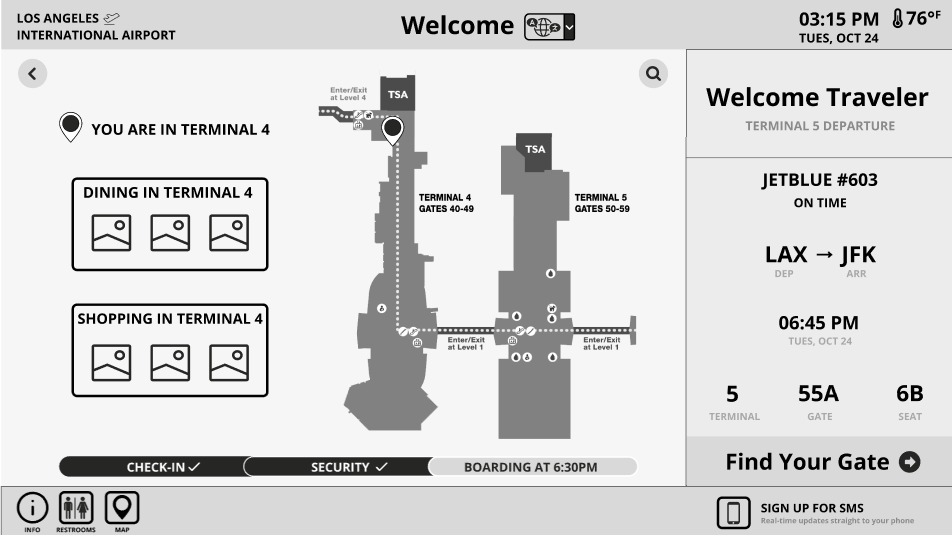
Direction Retrieval Opening Page
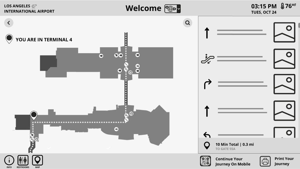
Direction Retrieval Planned Route
Low-fidelity wireframes of direction retrieval.
User Testing
With our initial prototypes, we conducted usability tests. To simulate a language barrier, we used a gibberish prototype and observed how users interacted with the interface. Several testers struggled to find the language selector, but the interface proved easy to use once the language was selected. We noted that testers preferred to print directions, but also wanted the option to export them to mobile for convenience. These findings led us to simplify the layout further, removing unnecessary options to reduce confusion.
Key Insights
• Several testers struggled to recognize the language icon, particularly when it was positioned in the corner of the screen.
• While most initially chose to export directions to their phones, testers expressed a preference for keeping the option to print available.
• Simplicity emerged as a crucial factor, as an excess of options on any screen led to confusion among testers about the next steps. This was especially true for the home screen, as many testers were unsure of how to proceed.
• Many testers were unsure about the kiosk's capabilities, commonly associating kiosks solely with airport check-ins. The design didn't immediately convey its role as a resource for multilingual navigational support.
User testing paper prototype.
Results
The final prototype of the LANA kiosk was designed with a focus on simplicity, accessibility, and addressing the needs identified through user research. It featured a clean, user-friendly interface that prioritized essential functions, such as scanning a boarding pass or selecting destinations from an interactive map. Based on the research insights, the home screen was also tailored to include language specific options, allowing travelers to navigate in their preferred language.
Visual aids, such as images of key airport landmarks and clear directional icons, were integrated into the directions to help users easily orient themselves within the complex airport layout. These visual aids were especially important for non English speakers, as they allowed users to rely on imagery to better understand their surroundings.
The interface was intentionally streamlined to avoid overwhelming users. It emphasized route customization, allowing travelers to receive directions based on their specific needs, such as the nearest restroom, restaurant, or gate. Additionally, the kiosk offered the flexibility to print directions or send them directly to users’ phones, catering to different preferences for how information is received. This customization was critical in addressing the diverse needs of international travelers, as it provided them with the autonomy they desired.
During usability testing, feedback was positive, with participants finding the system easy to navigate.
At a Glance
LANA prototype at a glance.
First Interactions
After language selection, a notification pops up on the corner of the screen prompting users to connect to LAX Wi-Fi.
Wi-Fi prompt.
Creating Route
Users are given options to select the map, look up their flight information manually, or scan their boarding pass or luggage tag for a personalized experience. Users are also able to stack multiple locations in one route
Personalized map after user scans boarding pass or luggage tag.
Receiving Directions
Users can choose to print directions or have them sent to their phones. The directions feature images of key landmarks, aiding non-English speakers in navigation by providing visual references.
Directions prototype printed and exported to mobile.
Reflection
This project highlighted the impact of language barriers on user autonomy, especially in a stressful environment like an airport. Developing a multilingual kiosk emphasized how thoughtful design can address language barriers and empower users to navigate independently. Through user testing, we discovered that simplicity and clarity were critical for ensuring accessibility, but challenges remained in accurately simulating the experience of non-English speaking travelers.
Looking back, one area for improvement would be conducting user testing with individuals who have firsthand experience navigating LAX without English proficiency. This would have provided deeper insights into their unique needs and challenges. Moving forward, the kiosk design could expand to include additional features, such as live assistance or real time flight updates, to further enhance the traveler experience.
